Simple Widget Example
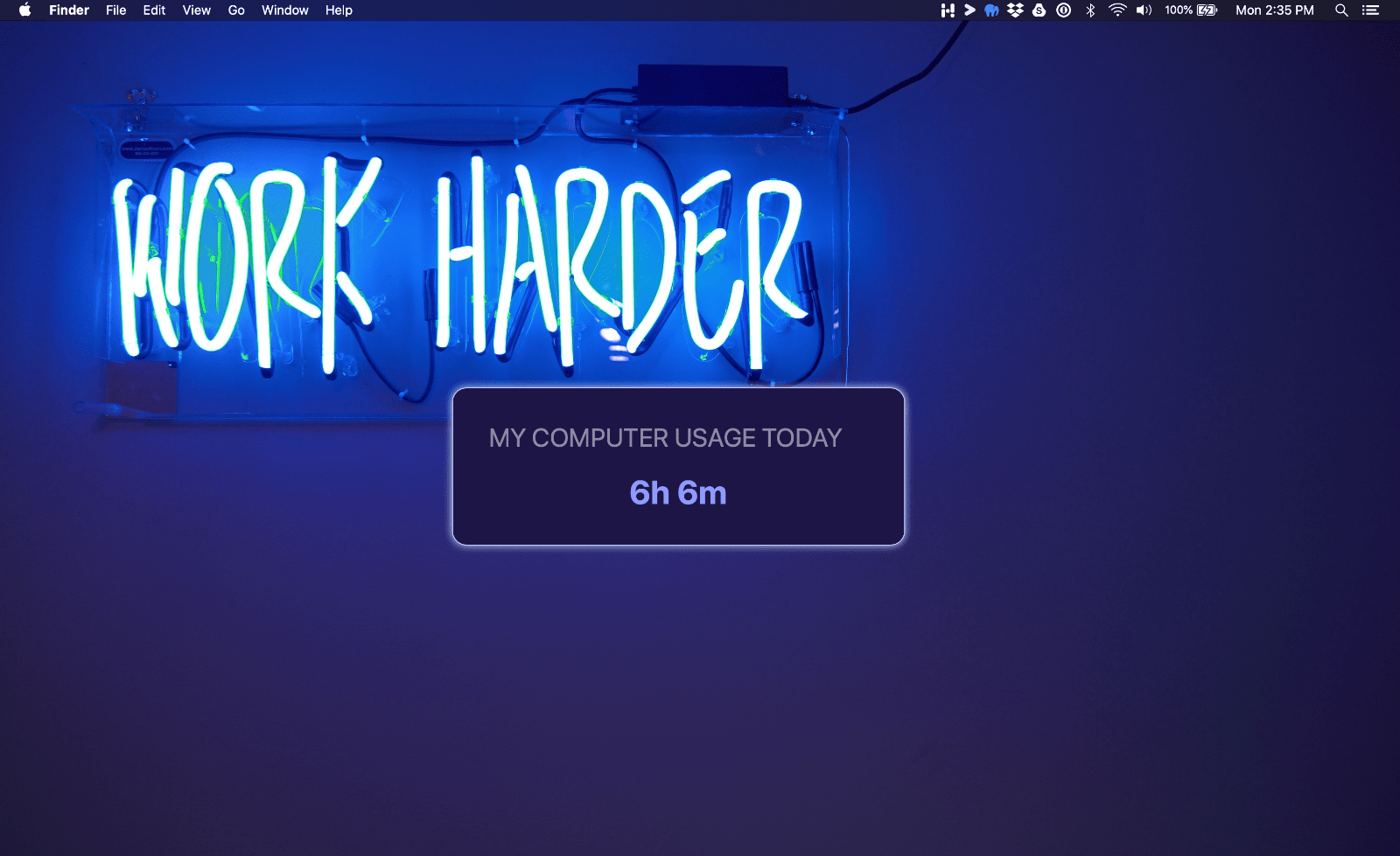
In this example we will create a simple widget that displays the amount of time you've spent on your computer today.
We will use a function in the Utility API to format the time. And we will make the color of the title and time editable in the settings.
Create a new widget
From within the Hologram application, navigate to the developer page and click the "New Widget" button. Name your widget "Computer Time Today", give it an ID of "time-today", and enter your name. Choose the hello world widget template, then click "create". Now open your widget files in a text editor.
Update widget.json
Open widget.json and replace the contents with the following:
{
    "name": "Computer Time Today",
    "id": "time-today",
    "author": "-",
    "version": "1.0.0",
    "description": "How much time you've spent on your computer.",
    "aspectRatio": "auto-height",

    "defaultSize": {
        "placementY": "top",
        "placementX": "left",
        "x": 20,
        "y": 15,
        "width": 0,
        "height": 0
    },

    "settings": [
        {
            "name": "font",
            "label": "Font",
            "type": "font",
            "defaultValue": "Normal"
        },

        { "type": "divider" },

        { "name": "backgroundColor", "type": "color", "defaultValue": "darkmuted", "defaultAutoColor": "darkmuted"},
        { "name": "titleColor", "type": "color", "defaultValue": "lightmuted", "defaultAutoColor": "lightmuted"},
        { "name": "timeColor", "type": "color", "defaultValue": "lightvibrant", "defaultAutoColor": "lightvibrant"},
        { "name": "shadowColor", "type": "color", "defaultValue": "darkmuted", "defaultAutoColor": "darkmuted"},

        { "type": "divider" },

        {
            "name": "borderRadius",
            "label": "Corner Radius",
            "type": "slider",
            "defaultValue": "40",
            "min": 0,
            "max": 100
        },
        {
            "name": "shadow",
            "label": "Shadow",
            "type": "shadow",
            "defaultValue": true,
            "defaultBlur": 10,
            "defaultOffset": 0,
            "defaultPosition": 0
        }
    ]
}
Notes:
The widget config is what defines a widgets, name, default size, settings, and other properties.
In the above code you'll notice it contains an aspect ratio. We are using auto-height which automatically sets the height of the container based on its contents. For this widget we could set a fixed ratio since it only contains one piece of data, but auto-height is the simplest way to ensure your widget fits within the container.
The settings array defines the settings that will be available to the user in the settings page. Here, we added a setting for the font, shadow, and a few more options. You'll notice we added two color settings, titleColor and timeColor. When we style the widget, we can use these colors so they can be edited by the user dynamically. You can learn more about widget settings here.
Update styles.css
Now you can add some css to make your widget look pretty! Open your styles.css file and replace the CSS with this:
.widget-container {
    border-radius: 0.4em;
    box-shadow: var(--shadow) var(--shadowColor);
    background-color: var(--backgroundColor);
    border: var(--borderWidth) solid var(--borderColor);
    font-size: 0.8em;
    height: 100%;
}
.widget-container-inner {
    padding: 1em;
}
.title {
    color: var(--titleColor);
    opacity: 0.5;
    font-size: 0.7em;
    text-transform: uppercase;
    margin-bottom: 0.4em;
    margin-top: 1.6em;
}
.time {
    color: var(--timeColor);
    font-size: 0.6em;
    margin: 0.6em 0;
}
We use ems for our font sizes and padding. This ensures that the widget will scale when it is resized.
Css variables are used so that way the widget can update how it looks dynamically. We'll set these variables in our widget Javascript below.
Update the components Javascript
Lastly, update your index.js file. Replace everything previously in it with the following code.
The code contains comments that explain it. We will further explain the key points below.
export default {
    extends: HologramWidget,
    data() {
        return {
            timeSpentToday: 0
        }
    },
    mounted() {
        // Get the amount of time spent on the computer today
        Hologram.get(this, 'computerUsageTimeToday', (timeToday) => {
            this.timeSpentToday = Hologram.util.humanizeSeconds(timeToday)
        })

        // Load the widget colors and assign them to css variables
        this.fetchAllColors(colors => {
            this.addCssVariables(colors)
        })
    },
    template: /*html*/ `
        <div class="widget-container"
            :style="{'--shadow': this.settings.shadow.boxShadow,
                    '--borderWidth': settings.borderWidth / 100 + 'em',
                    borderRadius: (settings.borderRadius / 100) * 2 + 'em',
                    'font-family': settings.font}">

            <div class="widget-container-inner">
                <div class="title">My computer usage today</div>
                <div class="time">{{timeSpentToday}}</div>
            </div>
        </div>
    `
}
Because we are fetching the time as a callback, Hologram automatically updates the time when it needs to change. This makes it easy to not worry about updating the time ourselves. And since we extended the HologramWidget component, the Hologram api will automatically stop getting the time if the widget is removed.
Since we extended the HologramWidget component, we have access to the settings object. This object contains all the settings the user has set for the widget. We can use this to set the font, shadow, and border radius and any other custom setting your create.
We hope you are impressed by just how easy it is to create a widget in Hologram!
